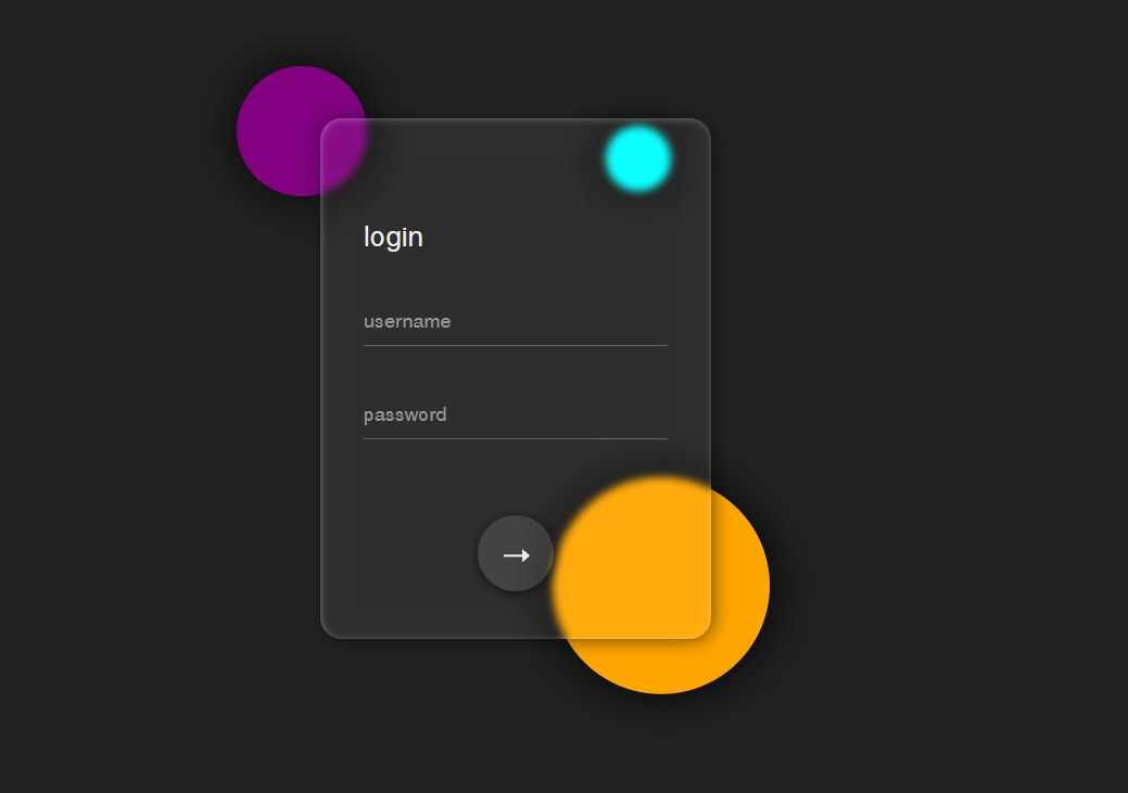
毛玻璃背景已被广泛应用于网页设计中,其关键代码是:backdrop-filter: blur(4px);
配合内外阴影设置,可达到最佳效果:
box-shadow: inset 1px 1px 6px rgba(255,255,255,0.3),
    2px 2px 15px rgba(0, 0, 0, 0.5);
本例实现毛玻璃表单特效,结合动画的使用让页面更具动感,下面是html代码部分:
    <div class="container">
        <div class="bg">
            <span></span>
            <span></span>
            <span></span>
        </div>
        <div class="glass">
            <div class="text">login</div>
            <input type="text" placeholder="username">
            <input type="password" placeholder="password">
            <button>➝</button>
        </div>
    </div>
css样式代码:
*{
    margin: 0;
    padding: 0;
    font-family:  Helvetica, sans-serif;
}
body{
    background: #222;
}
.container{
    width: 800px;
    height: 800px;
    margin: 0 auto;
    position: relative;
}
.bg{
    width: 100%;
    height: 100%;
    position: absolute;
    left: 0;
    top: 0;
    animation: bgscale ease-in-out 1s;
}
.bg span{
    background-color: #fff;
    position: absolute;
    top: 117px;
    left: 143px;
    width: 120px;
    height: 120px;
    border-radius: 50%;
    box-shadow: 1px 1px 50px #000;
    background: purple;
}
.bg span:nth-child(1){
    animation: move ease-in-out 3s infinite alternate;
}
.bg span:nth-child(2){
    top: 518px;
    left: 434px;
    width: 200px;
    height: 200px;
    background: orange;
    animation: move ease-in-out 4s infinite alternate-reverse;
}
.bg span:nth-child(3){
    top: 196px;
    left: 483px;
    width: 60px;
    height: 60px;
    background: cyan;
    animation: move ease-in-out 2.5s infinite alternate;
}
input{
    background: transparent;
    outline: none;
    border: none;
    border-bottom: 1px solid #666;
    width: 100%;
    height: 45px;
    color: #eee;
    font-size: 18px;

    margin-top: 40px;
}
.text{
    width: 100%;
    font-size: 26px;
    text-align: left;
    margin-top: 50px;
}
button{
    border: none;
    width: 70px;
    height: 70px;
    border-radius: 50%;
    color: #eee;
    font-weight: bold;
    font-size: 28px;
    cursor: pointer;
    margin-top: 70px;
    background: rgba(255,255,255,0.1);
    box-shadow: 0px 2px 10px #111;
    transition: all ease-in-out .2s;
}
button:hover{
    width: 160px;
    border-radius: 70px;
    box-shadow: 0 0 10px #999,inset 0 0 5px #333;
}
.glass{
    display: flex;
    flex-direction: column;
    align-items: center;
    justify-content: center;
    position: absolute;
    width: 360px;
    height: 480px;
    padding: 0 40px;
    box-sizing: border-box;
    top: 160px;
    left: 50%;
    transform: translateX(-50%);
    border-radius: 20px;
    color: #eee;
    background-color: rgba(255,255,255,0.05);
    /* 设置模糊和阴影 */
    backdrop-filter: blur(4px);
    box-shadow: inset 1px 1px 6px rgba(255,255,255,0.3),
    2px 2px 15px rgba(0, 0, 0, 0.5);
    animation: formfadein ease-out 1s .2s backwards;
    transition: all ease-in-out .2s;
}
.glass:hover{
    box-shadow: inset 1px 1px 3px rgba(255,255,255,0.9),
    4px 4px 25px rgba(0, 0, 0, 0.9);
    backdrop-filter: blur(7px);

}
/* 圆点上下浮动动画 */
@keyframes move{
    0%{
        transform: translateY(0);
    }
    100%{
        transform: translateY(-30px);
    }
}
/* 背景进入动画 */
@keyframes bgscale{
    0%{
        transform: scale(0,0) rotateZ(60deg);
    }
    100%{
        transform: scale(1,1) rotateZ(0);
    }
}
/* 表单淡入动画 */
@keyframes formfadein{
    0%{
        transform: translate(-50%,28px);
        opacity: 0;
    }
    100%{
        transform: translate(-50%,0);
        opacity: 1;
    }
}
演示链接:
https://www.shangjidong.com/demos/css-filter-application.html

这个效果好看!