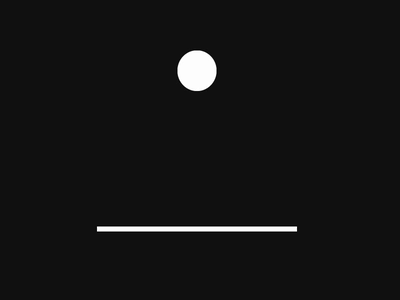
纯css实现弹跳,仿真重力碰撞效果,主要用到动画特效 animation ,它的6个属性为:
animation: name duration timing-function delay iteration-count direction;| 值 | 描述 |
|---|---|
| animation-name | 规定需要绑定到选择器的 keyframe 名称。 |
| animation-duration | 规定完成动画所花费的时间,以秒或毫秒计。 |
| animation-timing-function | 规定动画的速度曲线。 |
| animation-delay | 规定在动画开始之前的延迟。 |
| animation-iteration-count | 规定动画应该播放的次数。 |
| animation-direction | 规定是否应该轮流反向播放动画。 |
html代码:
<div class="boxwrap">
    <div class="ball"></div>
    <div class="ground"></div>
</div>
css代码:
body{
    margin: 0;
    padding: 0;
    display: flex;
    align-items: center;
    justify-content: center;
    min-height: 100vh;
    background: #111;
}
.boxwrap{
    position: relative;
}
.ground{
    width: 400px;
    height: 10px;
    background-color: #fff;

}
.ball{
    position: absolute;
    left: 50%;
    bottom: 10px;
    transform: translateX(-50%);
    width: 80px;
    height: 80px;
    border-radius: 50%;
    background-color: #fff;
    animation: falling .6s ease-in infinite alternate;
}
@keyframes falling{
    0%{
        transform: translate(-50%,-300px) scale(1,1);
    }
    90%{
        transform: translate(-50%,-1px) scale(.8,1.2);
    }
    100%{
        transform: translate(-50%,0px) scale(1.2,.8);
    }
}
最终效果: